Traditionally, banking has always been functional: to run a bank is hard enough and doing so competently was a competitive edge. But that model is changing: core banking infrastructure is now available as an API, ready to be plugged in by anyone who cares to leverage it.
And with the infrastructure being democratized, the competitive edge is shifting: companies move up the technical stack to innovate and compete. May the best customer experience win!
We call it the “Slackification of Banking”, because we’ve seen this disruptive trend before. In 2014, the team collaboration tool Slack took the world by storm and became the fastest company ever to reach a billion dollar valuation.
What was the disruption? Well, not much actually. Slack wasn’t innovating on the technological layer. Slack was just much nicer, than any other tool around. The colors were friendlier. The animations were smoother. The feedback was juicier. Everything about Slack felt easier and more fun. Even little details, like the release notes, were thoughtful and funny.
In a competitive landscape where any tool can get the job done… why not pick a tool you like?
A generation before, the McDonalds Happy Meal brought a delightful experience to kid and disrupted every parent’s life. It’s not that hamburgers were new, but no kid would settle for anything less than getting their Happy Meal. Similarly so for the stunning designs of Tesla, and that hand-written name on your Frappuccino.
In competitive markets, delightful experiences will win people over. And given that banking infrastructure is being democratized now, why would our industry be any different?
Without any further ado, let’s have a look at what delightful customer experiences look like and the signs that banking should follow the same path.
What does a delightful customer experience look like in banking?
Of course, every customer experience will be unique, but there are guidelines and principles at play here. In no particular order, consider the following:
Juicy feedback
Smoother animations, richer interactions, and extra attention to detail. Because the details are the perfect place to be playful and add that subtle extra touch.
Up Banking in Australia is at the bleeding edge of the Slackification revolution in banking. In fact, their entire customer experience looks and feels like Slack made a banking app. Even if you’re not in Australia, just browsing their website gives a feel for the level of detail and delight that went into the entire product.

Moments of awe
Individual moments matter and allow us to move beyond logic to create something irresistible. Suddenly, people can feel that even though your product is digital, you care to go the extra mile.
Apps like Nestlums focus on young kids and open a whole new experience around pocket money. Besides the fact that the app is one big game and art piece, the customer experience is packed with awe for it’s young users, and they make their first moves with money.

Effortless onboarding experience
The first experience of a product can often be confusing and complicated. Making this in particular an excellent place to sprinkle some love and create a standout experience.
Robo-investor Wealthfront offers one of the most outstanding onboarding experiences anywhere online. Prospective users who might feel overwhelmed at the idea of investing are greeted with an extremely simple process to determine goals and craft a strategy. The onboarding is simple, extremely user-oriented and to-the-point. Within minutes, you’re set up and ready to roll.

Art
Artwork is the purest form of delight. It’s risky, provocative, beautiful, or even emotional. In a world where the functionalities are already taken care of – art can thrive.
Creative labs like Cauldron are constantly pushing the edge of what’s possible and delightful. Take for instance the Saviour art piece: a hardware piece of art that you can place in your living room and subtly shows how much progress you’re making towards reaching your savings goal. Physical art to inspire and motivate saving – that’s absolutely brilliant.

Playfulness, fun, and surprise
Playfulness moves beyond gamification. While adding stars and leaderboards can help, the real delight is in little surprises, small easter eggs and a sense of play. More than functionality, it is the gesture that counts.
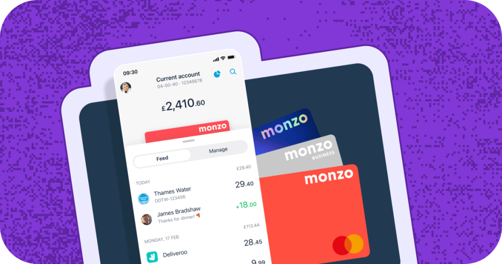
The Monzo debit card is an example here. They treated the debit card like a place to have fun. And sure enough, the bright coral-colored card was a sensation when it came out. It’s remarkable, it stands out, and draws attention to the full Monzo experience.

A human touch
In an ever digitalizing world, an easy competitive edge exists in offering a human and humane touch. People like to do business and interact with people, after all.
Examples of this are manifold. When Slack came out in 2014, the company was ridiculed by investors for having more customer success employees than sales people. Nowadays, most FinTech companies follow this example.
Strong values
This delight is on a philosophical level: transparency, clear pricing, doing things the right way, being honest. In a world where people distrust bankers, strong values go a long way.
Transferwise is an example here: for anyone who was tired of high charges, opaque exchange rates and hidden fees on international money transfers, Transferwise was a breath of fresh air. Transferwise continues to delight by adhering to strong values.

Impact that drives change
Consumers everywhere take their environmental impact increasingly serious. Product experiences that address these concerns immediately stand. Take Doconomy, for example: this Swedish Fintech company became known for its DO Black Card, which is the first credit card to limit spending not on available credit, but on the levels of CO2 emission caused by the owner’s purchases. To further educate consumers and brands about their impact and carbon footprint, Doconomy recently introduced the 2030Calculator to leverage Life Cycle Assessment (LCA) to estimate the carbon footprint of products and materials.
In providing such outspoken products and services, Doconomy takes a clear stance that easily attracts ambassadors and brand loyalists. We’re proud to say that Vacuumlabs tech leaders and developers helped to create and develop the 2030Calculator, and played a small role in furthering their mission.
When you are on a mission to change the world for a better place, you will have a lot of obstacles and excuses to overcome. Making your products fast, reliable and understandable for anyone will be crucial.

Stay On Top of the Customer Banking Experience
In order to sway new customers, the formality and procedures of traditional banking will be replaced with art, thoughtfulness and humanity. This shift is already picking up steam, and in the next 2-3 years, customer delight will be a clear competitive edge.
If you want to hear more about how is art applied to banking by Cauldron, creative lab of core banking company Thought Machine, listen to our latest podcast with their CEO, Mark Warrick!
Now, let’s go back to the Basics – Customer Experience 101: How to Improve Customer Experience in Banking
- Personalization
Use data to tailor services and offers to individual customer needs and preferences.
- Digital Innovation
Enhance mobile apps and online banking platforms for seamless, user-friendly customer experiences.
- Speed and Convenience
Reduce wait times, simplify processes, and provide 24/7 service options
- Omnichannel Support
Ensure consistent, connected experiences across all channels—online, in-app, and in-branch.
- Proactive Communication
Anticipate customer needs and provide timely updates, such as fraud alerts or product recommendations.
How to Improve Customer Service in Banking Sector
- Training
Equip staff with the skills to handle customer queries effectively and empathetically. - Automation
Introduce chatbots or AI to resolve simple issues quickly, freeing up staff for more complex inquiries. - Feedback Loops
Regularly collect and act on customer feedback to improve services. - Consistency
Ensure service quality is uniform across all branches and touchpoints. - Empowerment
Enable customer service agents to resolve issues without escalating them unnecessarily.
What Is the Importance of Customer Experience in Banking?
- Loyalty
Encourages customers to stay with a bank long-term with a smooth, friendly customer journey. - Trust
Good customer experiences build trust, which is even more crucial in financial services. - Competitive Advantage
In a crowded market, superior customer experience differentiates a bank from competitors and attracts new customers. - Increased Profitability
Satisfied customers are more likely to use additional services, boosting revenue. - Reputation
Word-of-mouth and positive reviews from happy customers can enhance the bank’s brand image.
Conclusion
In order to sway new customers, the formality and procedures of traditional banking will be replaced with art, thoughtfulness and humanity. This shift is already picking up steam, and in the next 2-3 years, customer delight will be a clear competitive edge.
If you want to hear more about how is art applied to banking by Cauldron, creative lab of core banking company Thought Machine, listen to our latest podcast with their CEO, Mark Warrick!
Curious to explore more? Wondering how these ideas can be integrated into your own product experience? Reach out to Vacuumlabs and set up a time to call with our creative teams.
May the most delightful products win.


